Well, my first instinct on playing the game was that the ideal solution would be something like this:
 |
| My original strategy |
...but, that's not quite how things turned out :) Read on to find out more!
So, here are some things I immediately observed:
Good stuff:
- This is pretty fun! You have little dudes moving around and they do stuff! It's fun to manage indirectly like this.
- Transportation does seem to matter! If there's no roads to anything, it takes people forever to get there. Also, if your factories and houses aren't built in a good setup, your output and construction rate is really slow because it takes people forever to get to work.
As for the rest of it, we'll have to do that in paragraph form because it's too involved to just list them.
Visual Clutter
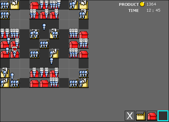
This prototype is hopelessy visually cluttered. A factory with three people working on it is almost impossible to make out:

When programming this, I as the programmer was mostly interested in what the people were doing - there's actually a fairly complex algorithm going on in the background as people get summoned by various "employers" (construction jobs or factories), keep track of their hours worked, and their current work state (idle, in transit, working, going home, sleeping, etc). I even made them have little indicators of their state - three dots for idle, a little hammer for working, a "zz" sleep bubble, etc.
But, it seems to me that as a player, I didn't really care. I just wanted to know what was going on with my buildings and my city. I think a better solution would be to make my people only fully represented when moving around. When they're actually IN the factory we would just do this:

Because, honestly, if the people are at the factory, we can ASSUME that they are working there. Furthermore, we need to be able to actually see the factory. Three little dots can easily tell me the same information as three people icons standing in front of it with hammers. We can do the same thing with houses:

People who are at home are only going to be doing one thing there : "sleeping." By that we mean, they are at home, resting, relaxing, whatever. This way, you can easily tell at a glance just by looking at the map when people are in transit - just look for people icons! Little dots on houses and factories tells you where everyone is currently residing and/or working, and clears up the visual clutter. Then, we don't need the little icons telling you a person's state : if he's moving away from the factory, we can assume he's going home, if we even care. Most of those little "status indicators" were useful to me for debugging purposes, but have little in-game value, IMHO.
Some Strategy findings:
- It is REALLY important to get houses up before factories, because there's no way to prioritize labor jobs except by distance. Lesson : make a little priority button that the user can set (Construction vs. Production)
- Since "product" isn't used for anything, I found myself mostly motivated to get my economy up and running first and then maximize "product." This meant that I delayed building factories as long as possible. There's nothing wrong with this, as there were plenty of construction jobs for people building other people's houses. We'll have to see how viable this strategy becomes when zombies come and attack :)
- Without anything other than my own impatience as a drawback, there wasn't any real incentive to maximize transportation. There should probably be some other sort of motivation (like zombies). Eventually, we also need to tie people's production back into the economy somehow, and find out how we're going to model resource use so we can build off some of the stuff we had in Energy Apocalypse.
Pack 'em in
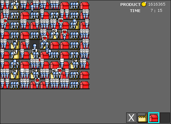
I mentioned earlier what I was expecting the ideal strategy to be : nice little sectors divided up by task, housing over here, industry over here, with transportation linking them together. My friend Sean, who is an expert at breaking games, immediately found the dominant strategy to be something like this instead:
 |
| Dominant strategy: Pack 'em in like chickens |
In the early prototype coding, I originally had buildings count as very high-cost terrain, forcing people to walk around them instead. This resulted in some really weird pathfinding because they would do everything in their power, even walk way out of their way in the dirt, just to avoid walking across a single building tile. This was especially problematic because the beginning and end point of every path was a building tile. Not thinking, I just made a building tile equal to a road tile in terms of pathfinding cost.
Big Mistake.
You see, doing it this way, and having there be no time pressure, makes it so that there is NO value to building roads, ESPECIALLY given that you can't destroy anything you've built. A road costs a third that of a building, but who cares? Wait three times as long and you get the speed bonus AND a useful building. Add to this that it's not realistic to be able to move through residential and industrial areas at highway speeds, and I think it's clear I need to change that part.
Now, with a prototype you're not trying to make an exploit-proof system. The purpose is to make something that's quick and rough around the edges, and you can ignore the exploits in a game session and play it the way it was intended to, to see if it works. But you still have to pay attention to those exploits in strategy, because it tells you a lot not only about your core game mechanic, but what needs to come next.
So, fix it so buildings cost the same as dirt or more to move over. Problem solved. But there's another problem.
Even with that fix, the ideal strategy is still OBVIOUSLY to build at least two houses for every factory (since there are 3 work shifts in a 24 hour day), and then pack them together as closely as possible, so you can have the maximum number of factories staffed for the maximum number of hours per day. It's like one of those industrialized chicken farms where the animals are stacked together like bricks.
Obviously this is efficient, but only because a lot of things aren't being modeled. Since our game is about energy economy and pollution as well as transportation, here's where the next features to be modeled start to trickle to mind:
- Pollution. Start by abstractly producing "pollution" in adjacent tiles to factories and roads. Follow this sort of pattern:

Factory Pollution
And a similar pattern for roads, but less:

Road Pollution
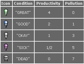
This is just to test to see if these things producing pollution will encourage players to space things out. Pollution effects will stack, which means that any stretch of road is going to have a value of 2 pollution on each road tile itself, and a 4x4 stack of factories will have 5 pollution each, with a 9x9 stack producing a whopping 12 pollution in the center factory. Note that there is no pollution in the center tile itself, that is determined by whatever is adjacent to it. - Health and living conditions. Pollution is not going to matter if it's just a number. So, we'll hit the player where it hurts: productivity. Their people currently produce at a rate of 1 man hour per hour. Depending on that person's health condition, that rate will go up or down. Here's an idea for what's coming next:

Pollution affects people's health - The color-coding system will be problematic for color blind people, but we'll change that later and just use this for now. We'll come up with some function that adjusts people's health as they move through tiles.It'll probably be something like this :A person has 24 "health hours" assigned to him, all beginning at a value of 2. To get the health of that person, we sum these up and divide by 24. (24x2 /24 = a beginning pollution rate of 2, in the "Good" range) Then, every hour, we take the average amount of pollution that player was exposed to.Examples: If you spend 1 hour in a pollution level 3 tile, you get 3 pollution assigned to that hour. If you spend an hour spread equally in a pollution level 0, pollution level 1, and a pollution level 2 tile, you get 1 pollution assigned to that hour. Whenever you get a new health hour, we bump off the oldest one in the array and add this to the end of the list. So a person's health gradually changes over time as he's exposed to increasing levels of pollution, and their productivity falls or rises with it. If their average pollution reaches 7, their health drops to "dead" and they are deleted from the game (or fall down on the spot, creating pollution, and someone needs to carry them away and give them a proper burial, depending on how realistically macabre we want to get).
Obviously, all of this is going to later be subjected to real-world research to make sure that real scientific findings match my intuition, and adjust numbers according to an eventual real-world model instead of this totally made up one.
The whole purpose of this is just to find out if our most basic, basic, approach to the game is on a good foundation. Once we've "found the fun" as Shigeru Miyamoto calls it, then I'll spend a month or so with my nose in a pile of books making sure the game is also a half-decent ecological simulation.
So, we're halfway to the design of the next prototype. As soon as it's ready we'll have another post documenting its conception and execution, followed by another post about its assessment and where to go from there. Feel free to leave your comments and let me know what you think!
We'll keep doing this until we eventually produce the actual game :)


5 comments:
[...] (RSS) « Design 101 : First Principles Super Energy Metropolis Prototype 1 - Results [...]
You make very good points about your icon usage. I did a small study into iconography and information content several years back.
I wonder though where will you make it obvious that a person in a house is sleeping, and a person in a factory is working? In the manual or tutorial? I do like the dots because they take up less visual space but also because the building being bigger than the icon representing the person suggests to me that the person is /inside/ the house, where as the older bigger ones, I might think of as being outside (since they're in front of and as big as the building).
However I can still see use for the status icons being transfered to the buildings themselves rather than the people. Just a single status icon to inform us what the activity of that building is and also, allow us a quick way of determining if anything is happening in that building. I'm assuming this information is a distinct advantage in playing the game. I'm not sure. It would also allow for the possibility of expanded activities within a building.
Just some random thoughts I had after reading this. :)
Good points, Fletcher. I'll have to see after I get started on the next prototype. I'll definitely have to explain things in the tutorial, as this game will be very icon and symbol-heavy, and I simply can't count on anything being intuitive by itself. I learned from SEA that a lot of the information *I* thought was important most players didn't care about, so testing and user feedback will be important, too.
I like the idea of the little dots inside the building, and it implies some animation as to the people going INTO the building. Implied animation is awesome =) It was pretty much impossible for me to tell what was going on with so many "people" icons and them being so big on the screen.
Also, I see you've taken into account this "buildings not being the same as roads" thing that I mentioned in the previous post. Definitely, pollution and health are the only reasons not to live right next to factories. Historically, the villager's workplace is in their own house. Bottom floor is the shop and top floor is the house. The only reason this changed is because to get a lot of people working in the same building required a building devoted to just that. So then in the industrial revolution, you had everyone working in factories all packed together, and then everyone living in apartments all packed together, and health issues were rampant. Then people realized that they really liked the country better, so the rich people all moved off to the suburbs, and the poorer people were stuck in the apartments. Thus goes the Megan version of history...
Maybe it's useful to look at the history of industrialization?
[...] Comments (RSS) « Super Energy Metropolis Prototype 1 - Results [...]
Post a Comment