 |
| Le Steve Jobs |
Then, I went to Architecture school and learned how to make video games. I know what you guys are thinking - "What in tarnation could Architecture school possibly have to do with video games?" Well, in detail, not a lot at all. In principle, quite a bit.
 |
| Gumbo: Mmmmm.... Cajun! |
That all changed when I went to Architecture school and learned a little trick called, "Design by First Principles."
Design by First Principles is simple, really : all design projects, be they video games, cathedrals, constitutions, etc, all come from the interplay of three things:
- First Principles (FP's)
- Limitations
- Design Decisions (DD's)
First principles are your goals. But more important than that, they have nothing to do with implementation. If you're trying to cross the river, your first principle is "get to the other side," not "swim across."
Swimming across is one way to accomplish your first principle, but you could also do that by finding a bridge, using a raft, or building a matter teleportation device. All these other things - swimming, using a bridge, etc, are design decisions, ways you go about accomplishing what you've set out to do.
And of course, the laws of physics, the fact that humans are not fish, the fact that clothes get heavy and weigh you down when they're wet, etc, are all limitations.
Believe it or not, "Design" is just problem solving by another name. Once you realize this, design ceases to be hidden magical art and becomes a process you can actually learn and teach. And you don't even have to pretend to be French! This should come as a great consolation to people who are allergic to black turtlenecks, as well as the French, who are probably sick of being stereotyped by this point.
So, where do we begin? Well, the first question you ask, is you look at the project you're about to design, and you ask yourself: "What the heck am I even trying to do?"
First Principles in Architectural Design
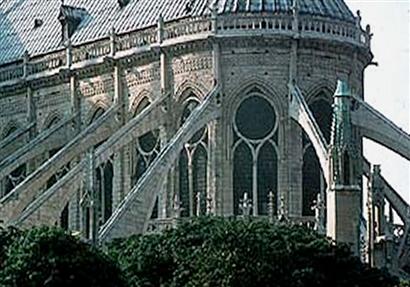
Let's start with an architectural example: a Gothic Cathedral. Have you ever wondered why they're designed the way they are? Well, somewhere in Old Europe, a team of Engineers, Architects, and Clergymen (and I'm sure there was quite a bit of overlap between those positions) sat down and asked themselves, "What are we trying to do?"
 |
| Notre Dame Cathedral |
They probably came up with a list like this one:
- Let's build a really big Church.
- It will be a landmark for our city and attract tourists.
- It will remind people of the majesty and glory of God.
So that gave them some guiding direction. Next, they had to sit down and look at their fundamental limitations. These are problems that, try as you might, you cannot do anything about. These are things like : budget, time, amount of labor available, etc. For our cathedral-builders, their list of limitations was probably something like this:
- We've only got wood, stone, glass, and iron as basic building materials. (ie, no portland cement, reinforced concrete, modern steel, plastics, etc)
- Gravity likes to keep things from being tall - it has to not fall down.
- We've only got candles and natural light for lighting. (No lightbulbs, electricity, etc).
Budget wasn't as big a concern for the Kingdom of France for this project as it is for us on ours, so that didn't really factor in. Anyways - they wanted to build a Cathedral on a truly monumental scale. To mark the celestial nature of the place, they wanted it to really be brimming with light. Now, before the advent of electric lighting, this was a hard thing to do, construct a huge building and have it not be, you know, dark inside.
So, what's an architect to do?
"Candles?"
Well, that's a start, but we're going to need more than that.
"Let's put in some windows! Really big windows! Windows all around, stained glass windows!"
Okay, that's good! But... we've got a problem. You see, with our primitive building materials, creating huge windows is going to eat up a lot of our wall support space. Now we've got these huge windows, and nothing but tiny little ribbons of masonry trying to hold up an entire Cathedral. We've got a serious structural problem here, and we just can't get around gravity.
"What if the walls didn't have to carry the load?"
What? What are you talking about?
"Well, you see, what if we just, you know, moved the load? Then the walls could just be filled with windows."
But where would we move the load? And how?
"Well, like, stick half of an arch on the side. We'll call it a, I don't know, a flying buttress or something. We'll put them all around. It'll be like having a bunch of really tall guys leaning over and holding the building up so the walls themselves don't have to."
 |
| Flying Buttresses - Designed by First Principles |
First Principles applied to Video Games
So, buildings are fun and all, but we make Video Games. So, let me trot out an example I'm sure you're all familiar with, and relate it to this specific methodology:
Let's say my name is Shigeru Miyamoto, and I'm making a game called Donkey Kong. My task right now is to design the main character. Here are my first principles:
- Make him look like a person.
- Make him animated.
That's it. My goals are pretty simple for this project. What about my limitations?
- He's got to fit inside 16x16 pixels
- 16 colors on screen at once (and probably only 4 for our character)
- Very limited animation
According to Chris Kohler in Power-up: How Japanese Video Games Gave the World an Extra Life, this is how it went down (in my own paraphrase):
 |
| Mario: Designed by First Principles |
- We don't have enough detail to make a recognizable face. Let's give him a moustache, since that implies both a nose and a mouth really well.
- We can't really make convincing hair, so let's just give him a hat and some sideburns.
- We can't make out his arms and legs when they move if they're the same color or have patterns on them. Let's give him overalls so his movement is more clear.
- Simple color scheme - blue can be used as "black" hair, a dot for his eye, as well as undershirt and shoes. Red can be used for the coveralls and the cap, and we can even reuse his flesh tone as a yellow button on his overalls to further sell the concept.
Ta-da. Mario has been born! He was one of the first video game characters that players really related to, in no small part because he didn't look nearly as generic and faceless as the rest of the supposedly human characters in arcade games at the time.
So, we can see how to take our first principles, work with them to get around our limitations, and achieve our goals. But what happens when your limitations change over time? What happens to design decisions then?
Leaving First Principles behind : a case study
 |
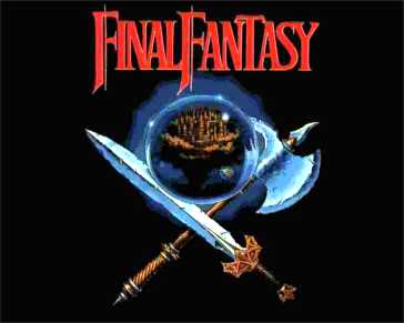
| Final Fantasy: A truly legendary game |
As a case study, let's take a game I'm sure you're all familiar with. It's called Final Fantasy.
So, once upon a time a down-on-its-luck game company called Squarewas really looking for a hit. So, they decided to try something new. Instead of another action game like they had before, they decided to create a game kind of like the popular Enix hit, Dragon Warrior.
You can read the background in lots of places, like here.
Ironically recognizing that the success of the company sank or swam with this game, it was called Final Fantasy by it's director, Hironobu Sakaguchi.
It is immediately clear that this game was heavily inspired by Dungeons & Dragons. In the first game, even the magic system was the same as D&D - you learned spells in various "circles" ("levels" in FF), which you could cast a limited number of times before you ran out. On going to an inn and resting, you would regain all your spells again. (In D&D, this was because mages had to spend meditation time every evening "re-memorizing" spells they'd cast during the day).
For the purposes of this discussion, we're going to focus on the design of Final Fantasy's combat system.
Although you often see people play D&D with miniature figurines for their characters moving about on a grid, this is a pretty modern phenomenon. It might have been around in the early days, but for the most part, the Dungeon Master would describe a battle ("There are six ogres in front of you!") and you would issue your character's commands to him. The whole thing was fairly abstract and required some imagination, but, with the right Dungeon Master, could be a thrilling experience.
It's my speculation that this is what Hironobu Sakaguch was trying to capture in Final Fantasy.
So, my guess is his first principle was:
- Find a way to capture the D&D combat experience in a video game
His limitations were many:
- There is a hard limit on the number of moving sprites the NES can handle at once.
- There is a limited number of colors on the NES
- There is a limited amount of screen size on the NES
- There is no scaling technology on the NES
- We have a small budget. This could be our last project.
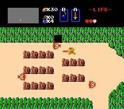
So, what this means, is that you couldn't do nice big illustrations of monsters roaming around the screen that the player could interact with. If you wanted to do things in real-time, you'd probably have something that looked more like the Legend of Zelda:
 |
| In Zelda, you fought with simple, blocky monsters because that's all the detail they could afford |
Here, Link moves around and beats things up with his sword, or his boomerang, or whatever. It's certainly a classic, but it wasn't really the same as it is in D&D at all. This is more of an action game.
Perhaps he could just have made the monster bigger and more detailed? Where, there's a problem there. You see, on the NES the limit is not just on the NUMBER of moving sprites but also the size - because bigger sprites are just made of smaller ones. A big creature the size of 10 smaller ones could hit the limit all by itself. So, if you want big, detailed characters, you could only have maybe one moving around on the screen. And if it's animated, you have such memory restrictions that you might not get to even have all that many different types of monsters in a game, and Sakaguchi wanted the kind of fully-fleshed out beastiary with hundreds of monsters that we've come to expect from Final Fantasy games.
So his team eventually hit upon a solution: abstract the battles.
 |
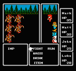
| Final Fantasy's abstract, turn-based battle system |
Instead of trying to simulate a battle in real-time, he made a nice digital approximation of D&D (and, of course, borrowed quite a bit from Dragon Warrior, itself inspired by D&D). In this system, you move around the overworld, and occasionally monsters attack you. The game takes you out of the overworld and into a battle mode.
"Hey guys! You're being attacked! There's four ogres in front of you."
"Cool! I want to cast magic missile!" (Or, you know, FIRE 2).
This way, we show the monsters on the left, with nice big illustrations, and the characters on the right. Since both of them are bigger, we can even show a little bit of animation - but not so much that we overwhelm our budget and memory constraints. Final Fantasy went on to be celebrated for having some of the best graphics of not just an RPG, but any kind of game, of its time. By "zooming in" to a Battle System, they overcame the limitations that depicting everything in the overworld came saddled with and achieved their objective.
Fast forward 14 years and 9 sequels to Final Fantasy X.
So here we are, in this lush, fully realtime 3D-rendered environment, not on the NES, but on the PlayStation II. It's even got voice acting! It looks really slick. And here I am, randomly wandering around in this beautiful environment, there's nothing around but me and suddenly-
 |
| Final Fantasy X's, um, abstract, turn-based battle system |
I'm not 100% sure about Final Fantasy X, but a lot of other contemporary games would even take the player from their specific lush 3D environment into a generic one vaguely representing the terrain to host the battle.
You see, back in Final Fantasy I, the "context" for the battle was an overworld where the character was a centimeter tall and just a blob of color traipsing around a vast map. The best we could do was maybe stick some trees in the background to represent where we were having a battle. But now, we're already rendering that lush 3D environment! Couldn't we, you know, just stick some monsters in the forest we're already in, rather than jump to a generic one?
Secondly, when the monsters are represented by static, non-moving illustrations, and my own characters are just tiny little icons, it's acceptable that one of them waves his sword to indicate "Bob attacked the Ogre with his sword." It's an icon of a hero attacking an icon of an Ogre. But when they're rendered with textures and lighting, and sitting there breathing heavily, it's really strange to have them just sit there patiently, waiting for the other guy's turn to run over, beat him on the head, and then run back to his proper place in line.
I don't know what the solution to this problem necessarily is. And for the purposes of this design discussion, it isn't necessary. I just use this example to point out that the limitations have changed. The same first principle, "Re-create the experience I had fighting monsters in D&D with my friends on my living room table" looks a lot different when you can render things in full 3D with animations and scaling and all kinds of other technology. The method used in Final Fantasy X was not designed with Final Fantasy X in mind, it was designed for Final Fantasy and just re-used.
So hopefully this gets you thinking about how to design things. There's a million different solutions to any design problem, I'm just here to make people aware of a method that's really worked throughout the ages. It works for buildings, it works for character design, it works for video games, it works for dang near anything. So get out there and make something cool! You can even wear a beret if you want :)


1 comments:
[...] Design 101 : First Principles [...]
Post a Comment